Heavy typography has been a prominent trend throughout 2017. With Apple first setting the initial trend on mobile with the release of iOS 10, web designers have been quick to further develop the direction in new and creative ways. As Apple continues to roll out heavy typography across almost all of their iOS apps, the trend looks set to stay for a while.
The results of heavy, emphatic typography are often visually impressive and can add some exciting and dynamic aspects to a website. In this article, we are going to round up some of the most creative implementations of heavy typography in web design in 2017.
Your Web Designer Toolbox
Unlimited Downloads: 500,000+ Web Templates, Icon Sets, Themes & Design Assets

Gregory Maslov
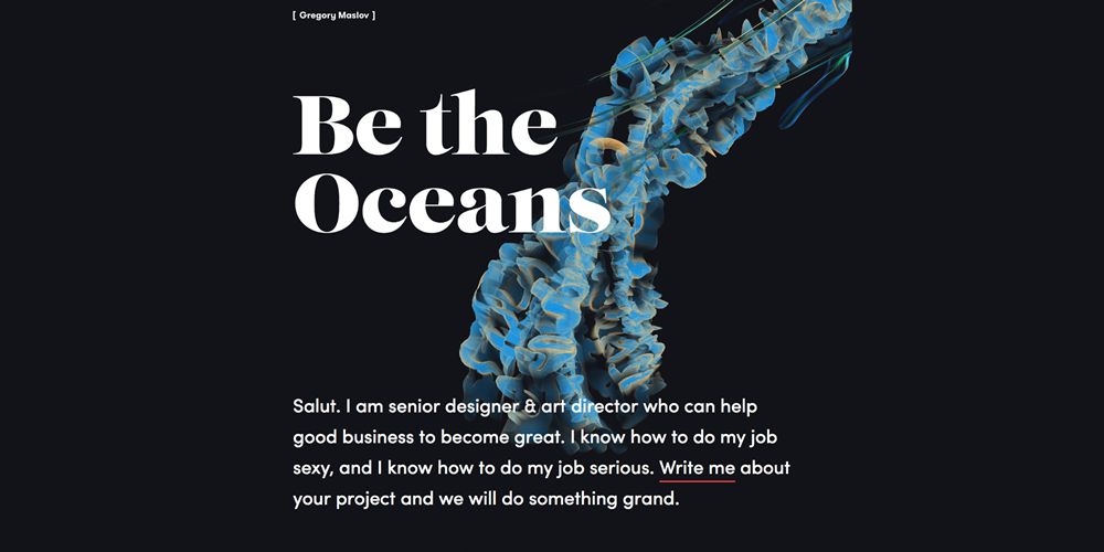
Gregory Maslov’s portfolio employs a large emphatic serif tagline against the vibrant and focused background image.
Havaianas
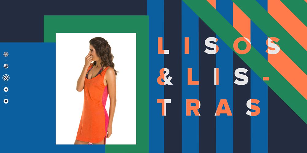
Havaianas’ playful, summer-themed design uses large heavy typography with emphasized spacing and unique color overlaps against the underlying patterns.
KOTI Sleepover
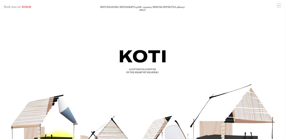
KOTI’s simple homepage design is one of the most subtle but effective implementations of heavy typography I have seen. The minimal illustrative style contrasts wonderfully with the large, black emphatic brand type.
Humaan
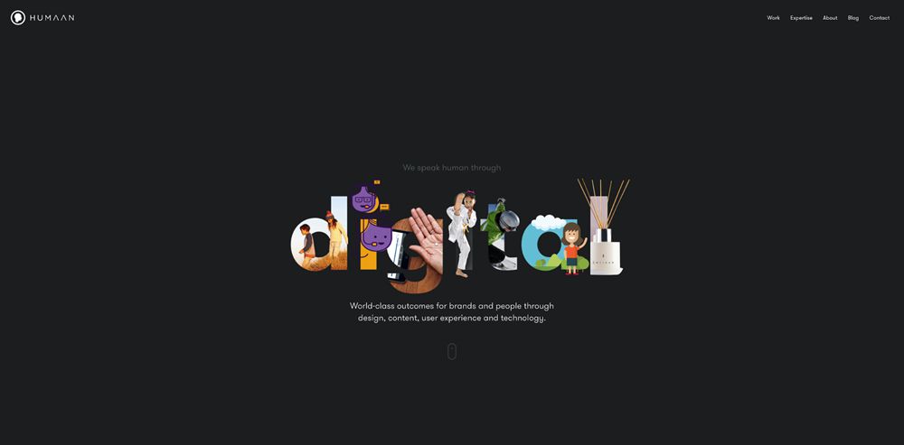
In one of the more unique implementations, Humaan has applied graphical designs to each of the heavy letters spelling ‘digital’. It’s a highly creative approach and has been executed superbly.
Work&Co
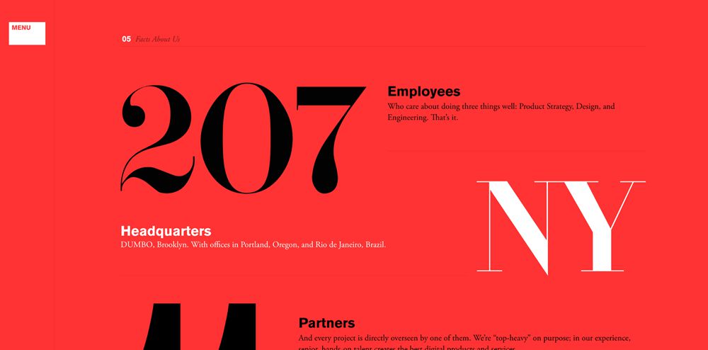
Work&Co uses excessively large and heavy serif typography to highlight the statistics and data around their company. The switch up of color from black to white is effective throughout in contrasting against the red background.
GHAFARI
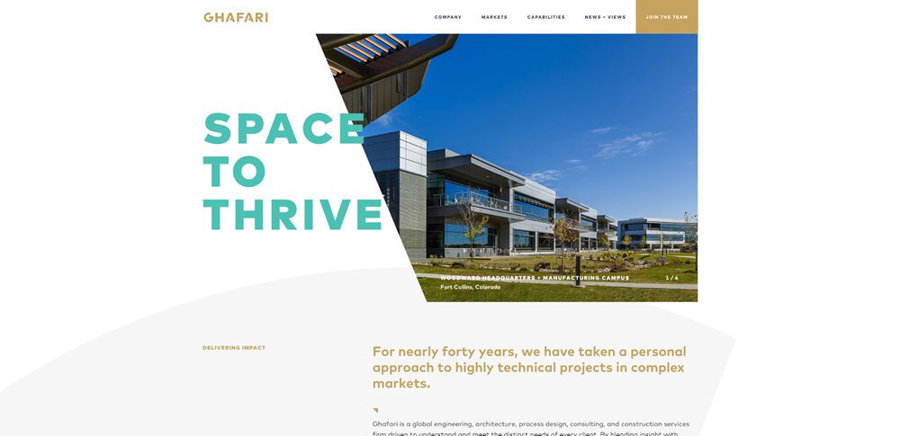
GHAFARI uses beautiful, teal capitlised lettering for their tagline. The text overlaps the image for a semi-brutalist effect and contrasts perfectly against the gold and white color scheme.
Super16
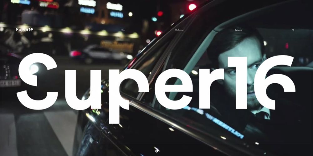
Super16 fills the entire hero section with their brand name. The heavy and unique typography – which subtracts 90-degree sections of the letters – is supported by a carefully selected series of motion designs in the background.
Huge
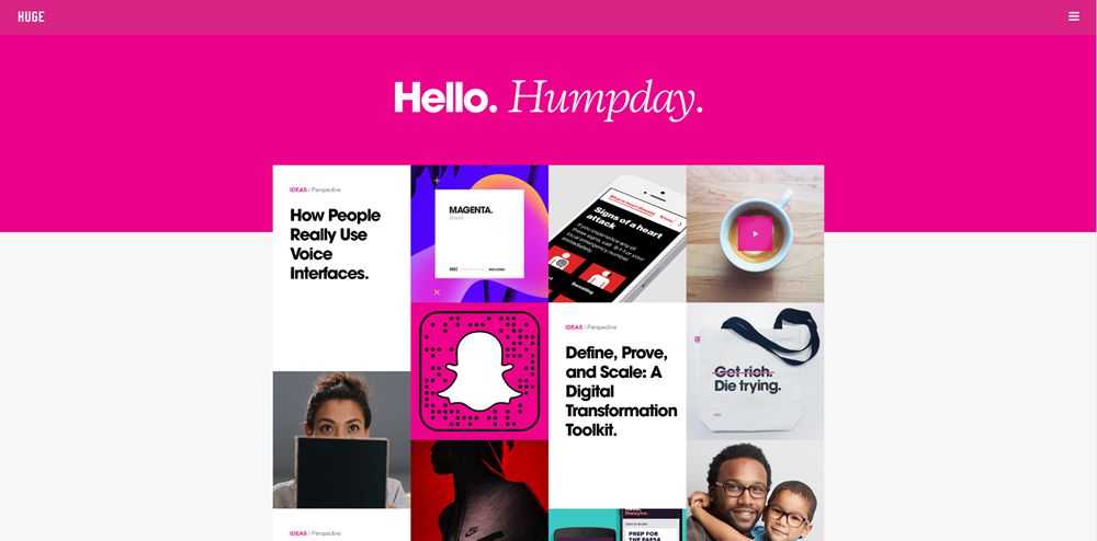
Huge uses a combination of heavy sans serif typography alongside lighter, italic serif typography. It creates an impressive juxtaposition and is particularly effective against the bold pink color that forms the hero section.
Shopify Credit Card Reader
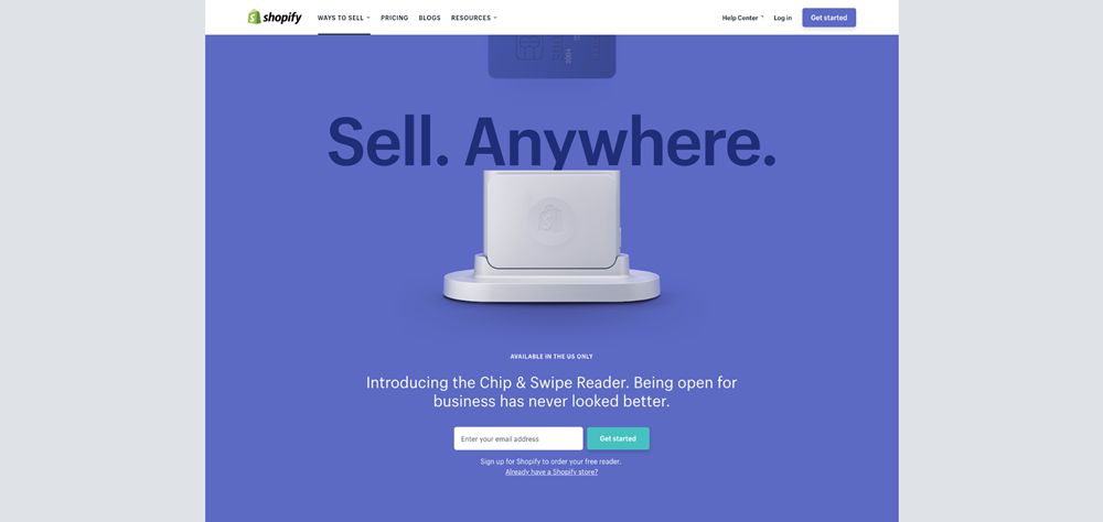
Shopify uses heavy but subtle typography behind their product photography to highlight the main selling point of their product.
UNFOLD
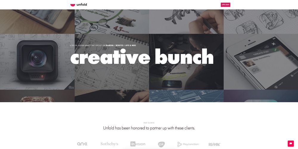
Unfold’s new homepage utilises some very heavy typography over the primary hero section. It contrasts beautifully against the busy darkened portfolio collage behind.
This post may contain affiliate links. See our disclosure about affiliate links here.