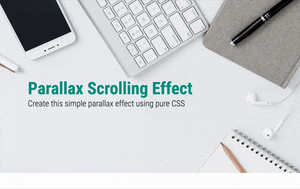
In this tutorial you will learn how to create a simple pure CSS parallax scrolling effect in the hero section of your landing page. Parallax scrolling is an effect where different visual elements on the page move at different speeds when the user scrolls. This creates a 3D effect adding a sense of depth and enhancing the visitor’s experience. This GIF shows what you will be able to create by the end of this tutorial.
You need to have basic knowledge of HTML and CSS to begin with. We will dive into a few advanced CSS topics such as perspective and transform towards the end. Let’s get started.
We are going to break this tutorial into two parts. In the first part we will be achieving almost the same look and feel of the page except for the parallax effect. That is, there will be no 3D effect. Just simple scrolling. If you already know how to do this, you can quickly rush through Part 1. In the second part, we will learn the advanced CSS concepts required and create the parallax scrolling effect.
Your Designer Toolbox
Unlimited Downloads: 500,000+ Web Templates, Icon Sets, Themes & Design Assets

Part 1 : Without parallax
Looking at the GIF, you can see that we have a header section with a background image occupying full viewport width and height, followed by a text section. Let us create this step by step.
Setting up
Create a blank HTML document and name it index.html. Add the basic HTML skeleton. If you use Visual Studio Code, all you need to do is type “!” and hit enter. You will end up with this.
<!DOCTYPE html>
<html lang="en">
<head>
   <meta charset="UTF-8">
   <meta name="viewport" content="width=device-width, initial-scale=1.0">
   <title>Document</title>
</head>
<body>

</body>
</html>
I have used the font ‘Roboto’ for the heading and ‘Lato’ for the paragraphs. So add the following line below the title tag to embed these using Google fonts.
<link href="https://fonts.googleapis.com/css2?family=Lato:wght@300&family=Roboto+Condensed:wght@300;700&display=swap" rel="stylesheet">
Create your stylesheet and name it style.css. Link the stylesheet to your HTML document below the Font Awesome CDN link using
<link rel="stylesheet" href="style.css">
You can download the background image used in the demo from Pexels or choose to include your own. But don’t forget to name it bg.jpg.
HTML
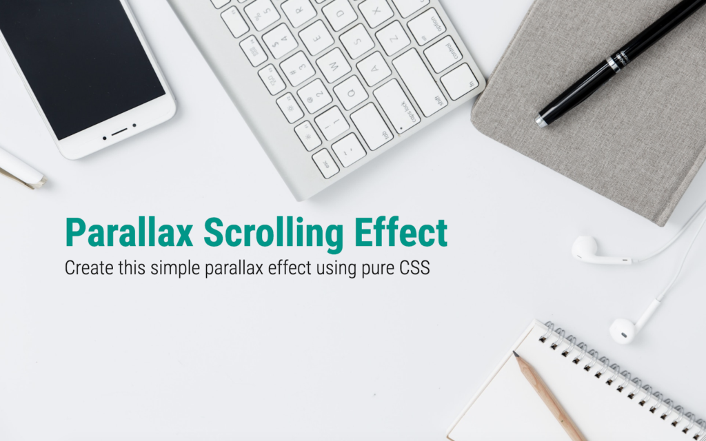
Add the following HTML code within body for the header:
<header>
   <div>
       <h1>Parallax Scrolling Effect</h1>
       <h2>Create this simple parallax effect using pure CSS</h2>
   </div>
</header>
Add the text section below that.
<section>
   <div class="container">
       <h3>Some cool title here</h3>
       <p>
           Lorem ipsum dolor sit amet consectetur adipisicing elit. Asperiores harum veritatis nemo magni odio reprehenderit atque, esse animi porro suscipit vero nobis modi quis. Exercitationem quasi beatae, assumenda officia illum sunt. Cum voluptas maiores vitae eius hic inventore deleniti placeat perferendis quam ut nostrum maxime optio voluptatibus ab laboriosam, quia consectetur atque minus?
       </p>
       <p>
           Adipisci amet aut sint voluptates delectus aperiam? Veniam ab illum enim in libero nihil culpa explicabo perspiciatis veritatis non repellendus architecto excepturi nostrum porro voluptatem aperiam animi asperiores, a voluptatibus temporibus minima voluptas ipsa! Recusandae nostrum, aut, voluptates est error iusto, eaque excepturi soluta quas maiores amet.

       </p>
   </div>
</section>
Everything else is now taken care of by CSS.
CSS
In style.css, begin with some common styles for all elements:
* {
   margin: 0;
   padding: 0;
   box-sizing: border-box;
}
Add these styles to html and body:
html {
   width: 100%;
   height: 100%;
}
body {
   width: 100%;
   height: 100%;
   /* Text styles */
   font-family: 'Lato',sans-serif;
   font-size: 18px;
   font-weight: 300;
   color: #212121;
}
Make the header occupy full viewport width and height.
header {
   width: 100%;
   min-height: 100vh;
   position: relative;
}
Let’s create the ::before pseudo element for header and add the background image.
header::before {
   content: "";
   position: absolute;
   top: 0;
   left: 0;
   right: 0;
   bottom: 0;
   display: block;
   background: url('bg.jpg');
   background-size: cover;
   z-index: 0;
}
You can now see your image occupying full screen. Now let’s bring the text in front and give it the required styling:
header div {
   position: absolute;
   z-index: 1;
   top: 50%;
   padding: 0 30px;
   font-family: 'Roboto Condensed', sans-serif;
}
header h1 {
   font-size: 4.5rem;
   font-weight: 700;
   color: #009688;
}
header h2 {
   font-size: 2.2rem;
   font-weight: 300;
}
You can now see this:
Add these to style the text section:
section{
   width: 100%;
   background: white;
}
.container {
   margin: auto; /* To center the text horizontally */
   max-width: 1000px; /* Limiting the width for extra large screens */
   padding: 80px 40px;
}
.container h3 {
   font-family: 'Roboto Condensed', sans-serif;
   font-weight: 700;
   font-size: 3rem;
}
.container p {
   padding-top: 30px;
   line-height: 1.8;
}
So far we haven’t done anything exciting yet. Let’s get to Part 2 where we create the actual magic (with just 8 more lines of CSS).
Part 2 : Adding parallax effect
To create a parallax effect we need to create a sense of depth by introducing a 3rd dimension. The CSS property perspective helps us do just that. Let’s say we add perspective:20px to an element. This gives a depth of 20px to that element. This means, a 3D space is created, and so the child elements can be transformed to make them appear to be positioned near or far from the viewer, creating a sense of depth.
So let’s add perspective to our body element along with overflow properties.
body {
   /* Existing styles here */
   perspective: 4px; /* The depth */
   overflow-x: hidden;
   overflow-y: scroll;
}
The overflow-x is hidden because we do not want any horizontal scrollbar resulting due to the 3D space created.
We also need to set overflow: hidden to the root element.
html {
   /* Existing styles here */
   overflow: hidden;
}
If you check your browser now, nothing has changed yet. It’s because we have just created the 3D space but not transformed any objects within.
The parallax effect happens when two or more elements are placed at different distances from the viewer. For that, we use the CSS transform property and “translate” the objects along the z-axis. So let’s transform the background image and the div within the header.
header::before {
   /* Existing styles here */
   transform: translateZ(-4px);
}
header div {
   /* Existing styles here */
   transform: translateZ(-2px);
}
We are moving the background image 4px away from the viewer and the headings 2px away. So when you scroll down, they seem to move at different speeds. Check your browser now. Still nothing right?
When we want the objects to be transformed in a 3D space, we need an additional transform-style property. This property when applied to an element, determines if that element’s children are positioned in 3D space, or flattened.
To understand perspective, transforms and all this in more depth, you can refer to the detailed guide to 3D transforms with CSS.
For now, add this property to header:
header {
   /* Existing styles here */
   transform-style: preserve-3d;
}
Now look at the result in your browser. Surprised to see that your background image and headings have shrunk in size? Keeping that aside for a moment, scroll down and you will see that the parallax effect is actually created! Why did these two elements shrink? It’s because they have moved farther away from you, remember? Objects that move farther appear smaller. Simple. But how to fix this? There’s a scale factor to be added along with translateZ to correct the size. This Google article gives us a formula to calculate the scale to apply.
scale = (perspective - distance) / perspective
For our background image, perspective is 4px and distance (translateZ) is -4px. Calculate:
scale = (4 - (-4))/4 = 8/4 = 2
Similarly, for header div, the scale is 1.5. Let’s include these. Change the transform properties of both the elements to include scale.
header::before {
   transform: translateZ(-4px) scale(2);
}
header div {
   transform: translateZ(-2px) scale(1.5);
}
This fixes it. Now scroll down. Do you see the effect? The only issue is that our text section is being overlapped by the header. The solution to this is to set a higher z-index to the section (along with a position property, otherwise z-index won’t work).
section{
   /* Existing styles here */
   position: relative;
   z-index: 2;
}
And there it is! A simple neat parallax scrolling effect for our hero section is achieved.
Extend this newly acquired skill and go create beautiful, pure CSS parallax scrolling websites. But be careful not to overdo it. If you got stuck somewhere in between and couldn’t achieve the desired output, here’s the complete source code.\
This post may contain affiliate links. See our disclosure about affiliate links here.


