Whether you’re designing for the web or for print, you want your efforts to stand out. As any great graphic and web designer knows, the typography you use is much more than just a few letters on a page or screen – the fonts you use can tell a story.
Custom font faces are present in designs all over the web and in print. So, if you’re looking for fonts with that ‘wow’ factor; you’re in luck.
Note: We have created a fresh collection of cool, modern fonts! You can check them out here – 400+ Best Modern Fonts Collection for 2015.
Table of Content:
List of The Coolest Fonts For 2016
We have scoured the web to find 35 of the coolest looking fonts and examples of clever and creative typography that you really don’t want to miss. Typography is one of the most important parts of any design.
1. Astonished
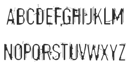
Astonished is a grungy serif font that is super cool and great for all sorts of designs. The smudge-effect on the letters makes this type more than just a basic heading. You could use this for a whole host of printed or online designs, and for a whole host of industries.
2. Stiff Staff
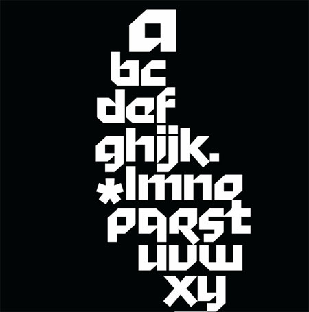
Stiff Staff is a highly decorative font that packs a punch. The combination of sharp lines and corners and an edgy hint of italicism makes this perfect for an eye-catching and memorable logo. Again, this typography lends itself better to smaller blocks of text, but is the perfect modern type.
3. Ribbon
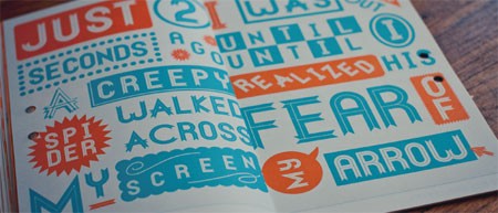
Cool and quirky, Ribbon is an eye-catching and alternative font. Each character ends with a ribbon detail, really adding an extra dimension to your letters and designs. Ribbon pairs harsh lines with deep curves for a juxtaposed font face, perfect for headings and bold statements.
4. Diamonds
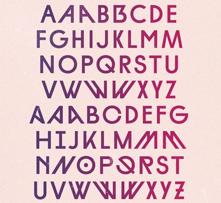
Diamonds is an experimental, geometric font that is easy to read but still commands attention. The unique shaping of the characters, combined with the spacing and slanting, makes this the king of super cool fonts. If you’re looking to make a statement, this is the font for you.
5. American Donuts
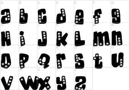
Show your patriotism with this ‘stars and stripes’ inspired font, American Donuts. With an appearance as quirky as its name, this is the perfect font for any retro Americana design. Reminiscent of Elvis’ heyday, this would look great on a poster, flyer, or brochure.
6. Showtime

If you’ve ever wanted to see your name up in lights, Showtime is the perfect font to make these dreams a reality. Each character is surrounded by dots, and when included in brackets, gives the illusion of a Broadway sign. What better way to make your headlines stand out?
7. Spicy Rice
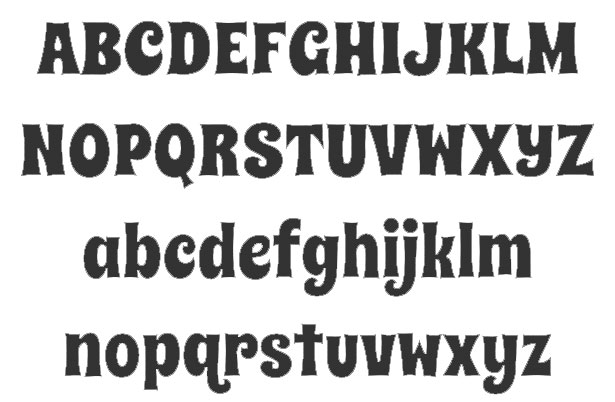
With clever kerning, curved attributes and a unique thickness to the characters, Spicy Rice is a must-download free font. The perfect juxtaposition of retro and modern; this type would make a bold statement on any website or piece of printed marketing.
8. Blomster
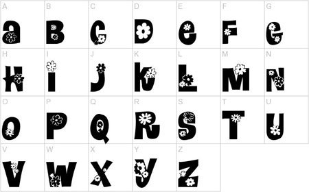
Continuing the retro, ‘60’s feel, Blomster is a nod to the days of ‘flower power’. The cute flower detailing would perhaps be too much for large blocks of text. But it would look great on a poster or headline. You can target women, and retro lovers with this font; the possibilities are endless.
9. GOTA
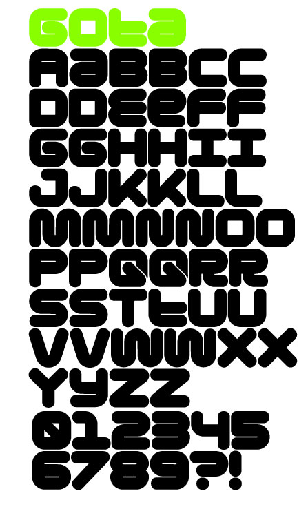
Fresh, funky, and youthful; GOTA is a great font for contemporary designs. If you’re looking to reach out to a younger audience, this is the font that will get their attention. GOTA will work well in almost any kind of graphic design, but we think it will look best on posters, t-shirts and logos.
10. Champagne & Limousines
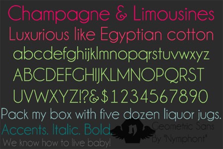
Add a touch of class and glamour to your designs with the Champagne & Limousines typography. The curvature of the letters, the kerning and tracking of the font, and the whole ‘feel’ make this the perfect font for an up-market product.
11. Amadeus
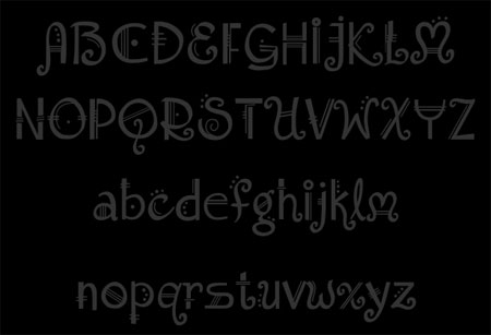
Amadeus is a font with a real musical feel. There is nothing ‘normal’ about this type which makes it super cool. Create a statement and use it as a headline, or add the ‘wow factor’ to your designs and use it all over.
12. Weston font
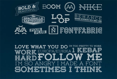
Weston is another beautifully designed, rounded slab-serif font. The subtle curvature and modification of the font makes it the perfect choice for a headline or a logo. It is simple enough to be easily read – both on screen and in print – but is different enough to make your designs ‘pop’.
13. Cheri Font
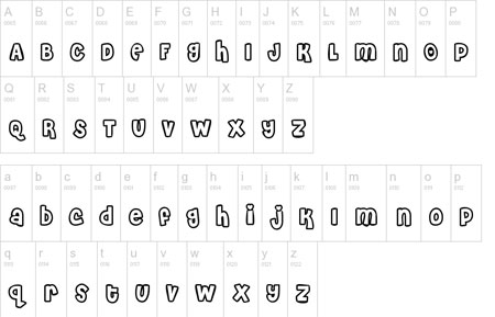
Everything about Cheri is super girlie. The kerning sees the letters overlap, and the 3D effect of the characters only adds to the feminine touch. But what makes it ideal for female-friendly designs is the cute hearts above the ‘i’ and ‘j’, and the heart shaped period. Perfect for a romance-themed design project.
14. Alexis Font
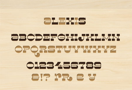
Bring the Wild Wild West to your website with this free font, Alexis. The carved wood effect of the letters, and the variation in thickness gives this a real DIY appearance.
15. Fat Frank
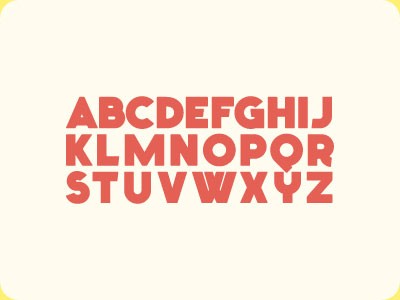
Simple, but effective, if you’re creating designs for food retailers; Fat Frank is the font to whet your appetite. The chubby characters are cute and quirky and give you loads of room to let your creativity run away with you.
16. Little Trouble Girl font
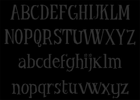
With an air of mystery and a hint of spooky surrounding it, Little Trouble Girl is a distressed looking font to enhance your designs. Don’t be fooled by the sweet floral detailing on the lowercase ‘i’; this is one grungy font .
17. BellBottom font
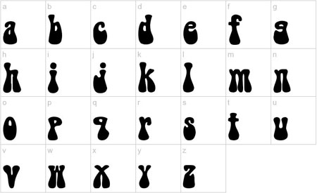
BellBottom – as the name would suggest – has a real 70’s feel to it. With each character really shaped like the flared trousers of the era, this font is perfect for ‘old school’ designs. After all, what says ‘cool’ more than the ‘70’s?
18. Broken 15 font
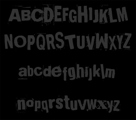
Broken 15 is a highly creative and original font. In the style of a ransom note, this font uses variation in the kerning, leading, and tracking of each character in a really imaginative way. You can add a real DIY element to your web and print designs with this font.
19. DAN
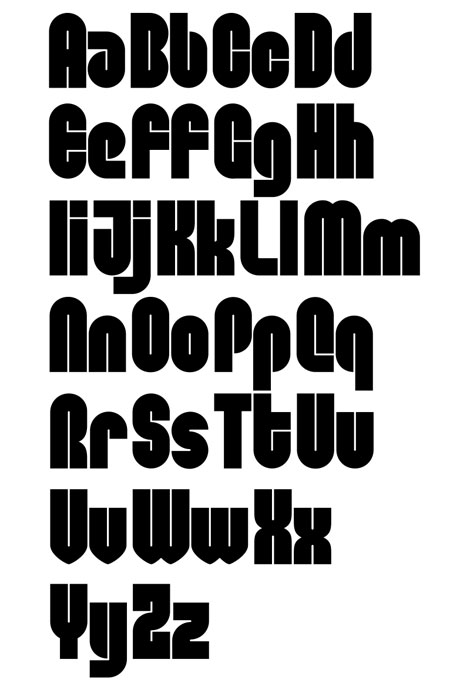
DAN is certainly one super cool font. The unique shaping and kerning of the letters will make your designs stand out from the ordinary. We love the juxtaposition of the curves with sharp points in the letters. This is a great design choice. DAN is a font best suited to offline materials though, as it may be tricky to read on a screen.
20. Deco Neue
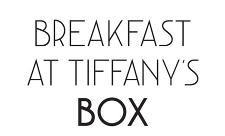
Deco Neue is an art deco inspired font that would be perfect for any of vintage and retro themed designs. The creative and classy font would look great either in print or on the web. The nature of the font lends itself best to smaller amounts of text, rather than reams of copy.
21. Spotted Fever
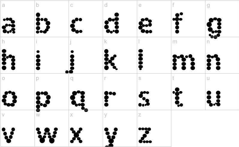
Not for the faint of heart, Spotted Fever is certainly a stand out font. The rounded letters, made of dots of varied sizes, certainly pack a punch. Much like these other heavy design based fonts though, Spotted Fever is best kept for smaller blocks of text. Too much of this and your audiences’ eyes will begin to hurt!
22. Sketchetik
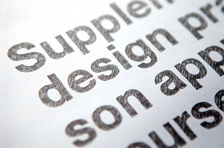
Hand drawn fonts are hugely popular right now, and Sketchetik is one of the best around. The shading of the letters only enhances the handwritten element, making it the perfect font for a print design.
23. Kingthings Gothique
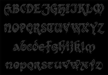
Kingthings Gothique is a really ornamental, almost Egyptian inspired font. The curved letters and close kerning make this best for printed headlines. It is perhaps too decorative for the web.
24. Fatboy Slim
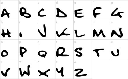
Like its 1990’s DJ namesake, Fatboy Slim is a fresh and funky font. Featuring elements of both handwritten and graffiti style fonts. This modern font would work great on a poster, billboard or as a graffiti inspired piece of advertising.
25. Awesome
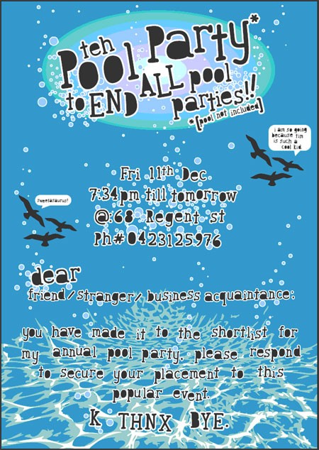
Youthful, quirky and refreshingly different, Awesome is just that. The white space in each letter is coloured in, giving this font a really interesting look. We think this font would look great on a poster, or website for a really quirky new product.
26. Slapstick Comic
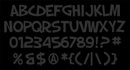
Slapstick is one of those fonts that wouldn’t look out of place in a cartoon. The chunky letters, close kerning, and slight italic effect adds a real youthful look and feel to the font. Cool and casual, this font would look great in print or on the web.
27. Painted
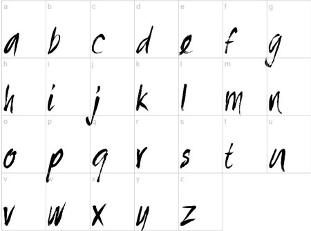
As the name suggests, Painted is a brushed font that looks like it has been drawn by hand. The flicks, letter shaping, and faded effect all add to the DIY element. This typeface would work really well on a poster, flyer, or other printed marketing material. It is a fresh and quirky font that can add a real personal touch to your designs.
28. IceCream Soda
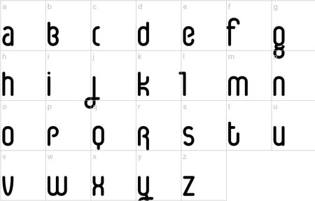
Rounded, sans-serif font IceCream Soda is just that – very, very round. The elongated letters are polished off with deep, rounded shapes. Very 1950’s in its appearance, this would be a great font for retro inspired printed marketing materials, and vintage websites.
29. Vanilla
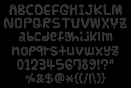
With the perfect mix of rounded squares and clever shapes, Vanilla is a great font to add depth to your designs. This creative font would really appeal to a younger audience or a youthful product.
30. GOCA LOGO
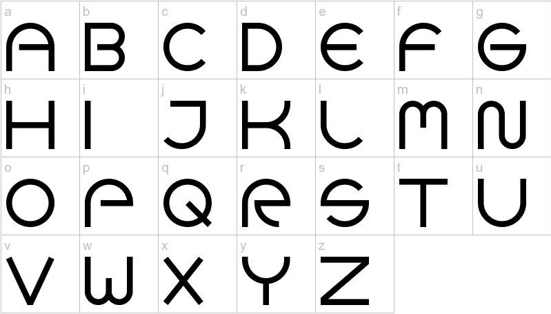
Rounded serif font GOCA LOGO capitalizes on semi-circular shapes and deep swirls to create a memorable typeface. Each shape looks like it is made out of one part of a circle, giving a really warm and open feel. This would be the ideal font for a flyer, brochure, or headline.
31. SeasideResort
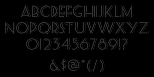
SeasideResort is a gorgeous, vintage style font. Reminiscent of the 1950’s, this would make a great headline font for a retro themed design. This is one super cool font that will speak volumes about your designs.
32. Bridgenorth
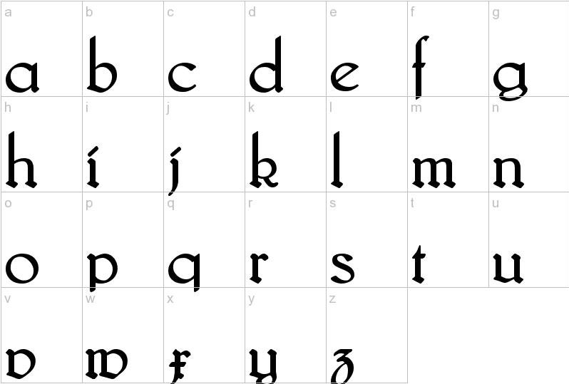
A Gothic style font, Bridgenorth is perfect for designs conveying a vintage and high brow field. It combines traditional Gothic font elements, with rounded edges and an almost squashed feel to produce a really interesting design. Great for ‘old style’ mail shots and marketing campaigns.
33. Facet
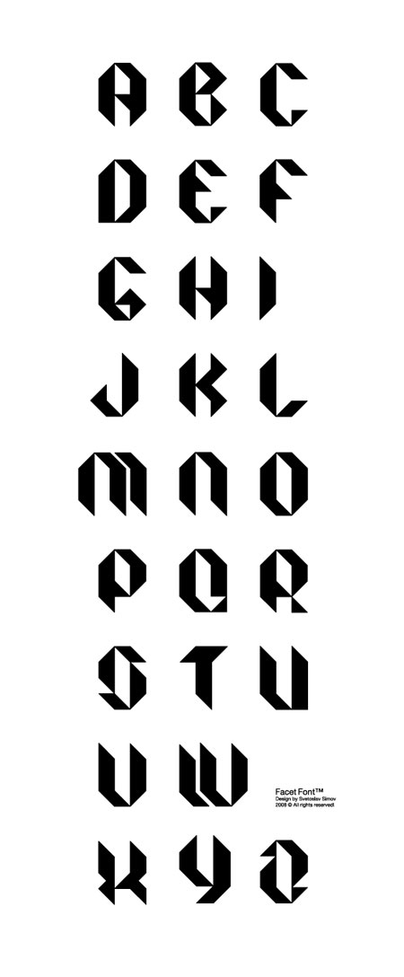
Facet is a strong and bold typeface, which would certainly make a statement on any website or piece of printed business literature. The almost square shaping of each letter, the harsh lines, and spiky corners would make this perfect as an attention grabbing headline. Definitely one of the coolest fonts from collection!
34. Burnstown Dam
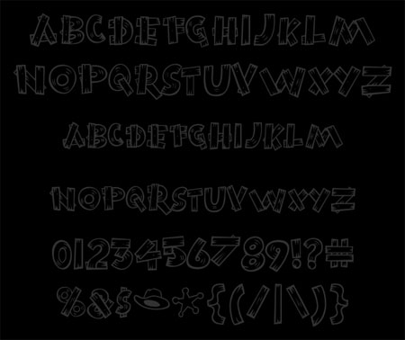
Burnstown Dam is a great novelty font, which is perfect for themed designs. The wooden plank effect is perfect for a Wild West themed design, or something along those lines. The casual style makes it stand out as a great headline font.
35. BudHand
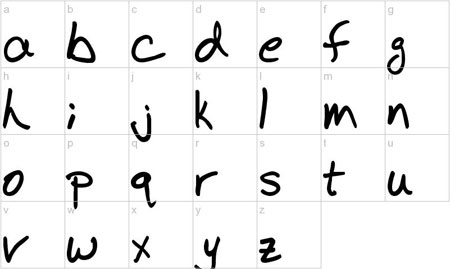
BudHand is our final super cool font, and is another handwritten gem. The overlapping lines in the letters and the differing loops and lines make this really stand out. This font would work great on a mail shot. It adds a personal touch, but is clear enough to read on paper or on screen.
Want More?
We have created a fresh collection of cool, modern fonts! You can check them out here – 400+ Best Modern Fonts Collection for 2016.
How to Safely Match Web Design and Typography
Now that you have seen some great fonts, we wanted to provide you with some guidelines on how to match them in your next project. So with no further ado, let’s get started.
As web designers, our designs have to be both usable and attractive, communicate information and create a name. Our designs must be technically proven and tested for our dear readers. With that in mind, web designing is definitely a form of communication and nowadays, this type of communication is very, very important. As a form of communication, we, as web designers do the speaking and we hope our readers and viewers listen.
For all types of communication, the most important thing is to be able to fully transmit the message to the receiving end. In other words, in web designing, the most important thing is to make our readers understand whatever it is we are trying to convey. This is where typography comes in. If the text in our design is too small to read, or too cramped up, or if it irritates the audience while viewing the design, the page won’t get a second glance.
Now, 95% of the information communicated on the internet is written language. Therefore, it’s just logical to suggest that a web designer should preferably get effective training in the key discipline of shaping written information, putting it simply: Typography.
Marriage of Typography and Web Design: Why is Typography Important?
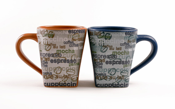
Whenever people visit a website you have designed, chances are they won’t care much about the illustrations or pictures or sounds, people will immediately look at the text.
People search the internet hoping to find the information they need. They are looking for information and this information come in the form of text content. How else are we supposed to communicate the message we want while integrating it in our design?
Regardless of how many special features you have built into the website you’ve designed, everyone will always depend on text content to obtain whatever they want when visiting the site. This alone should make typography a suitable wife for your web design.
So, why is typography important?
1. People immediately look at the text of your web design.
Thus, you want your text to be as catchy as possible. Not flashy, but catchy, just enough to keep the readers interested. For example, what do you think headlines are for? Correct, headlines are there as headlines to grab the readers’ attention.
2. 90% of your web design is typography.
If we master that 90%, which is typography, we can already say that our web design is a huge success.
3. If you do not give importance to typography, you won’t reach your readers.
Readers are like spoiled brats (no offense), they like to get what they want, when they want it. They want to get what they are looking for in an instant. That’s why you need to have a design that can attract and maintain the interest of the readers. In order to do that, you need to have a proper blend of typography and graphics.
The Golden Rule: In Search of A Perfect Font
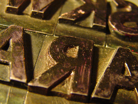
Our goal as web designer is to showcase our designs to the whole world, and convey information and a clients message through design – in written language!
Speaking of written language, not a lot of people (who just might stay and have a blast with your site!) have the same fancy lineup of fonts that you have. Therefore it just follows that the very first rule in web typography is that web designers should use default fonts.
In order to wow(!) our readers, we need them to be able to read and understand the information and messages we want to convey in our web design. To do that, we need to utilize fonts that all computers have.
Differences Between Serif and Sans Serif fonts
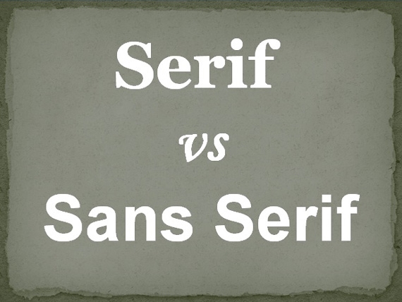
Let’s begin with the serif family. Look at the image above. Do you notice those cute little finishing strokes? That’s Serif. If we remove those cute curls and little blobs at the end of the strokes we get Sans Serif.
When creating our designs, we should always consider these types of fonts. All our readers’ computers, for sure, have these fonts!
Here’s the list.
Sans Serif
- Arial
- Geneva
- Helvetica
- Lucida Grande
- Lucida Sans Unicode
- Tahoma
Serif
- Book Antiqua
- Georgia
- Palatino
- Palatino Linotype
- Times New Roman
It is said that the Serif family is the older one and originated from the Roman Empire. It is very wise to use Serif in our content body because it guides the horizontal flow of the eyes. And Sans Serif? As we all know, headlines are very important and we need it to catch the readers attention. That’s why Sans Serif is the best choice for headlines. Using Sans Serif as font for headlines helps the headlines pop out from the whole article.
Thus, the most popular combination that CNN and BBC use is to use Serif for the article body, but use Sans Serif for the article headline.
Spacing Between Lines of Text
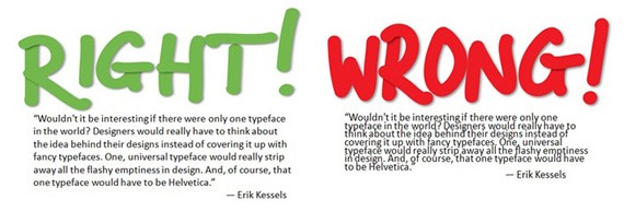
Another term for this is line height. For a great web design, line height is a very important factor to consider. I’m sure each and every good web designer out there already knows this simple fact.
Before we become web designers, we are readers of our own design. We want our design to be as easy-to-read as possible, and we want everything in our design to look good. That includes line height.
The best, and perhaps the easiest, way to achieve the most natural balance in the typography of our web design is to use the em measurement in CSS.
It’s a wise decision to utilize between 1.2em and 1.4em. This approach makes sure that the reader will not have a hard time differentiating between the lines of text you’re presenting and will be able to comprehend the text much better.
Limit Your Typefaces
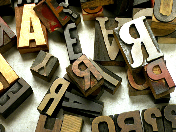
In the field of web design where creativity and an unlimited source of it is very important, it is really, really hard, especially for beginners to see the fine line that separates a great web design from a very confusing one.
It is very easy to get lost in using a lot of fonts in our designs. Everything always seems good for something. This one’s great for this, and that one’s great for that. But in reality, web designs which include a lot of different fonts are generally unpleasant and confusing to look at. By doing this you may overlook the element of consistency your design should have. This does not necessarily mean that it is best to just use one font, however, try limiting it to two to three fonts per page
Tools for Web Designers
The following tools can help beginners (and experts) with their web design and typography.
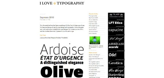
1. I Love Typography
This is perhaps one of the coolest typography blogs on the planet.
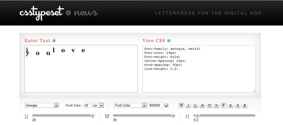
2. CSS Type Set
Enter the text you want to modify, test its readability, and see how it will look like in any style you set.
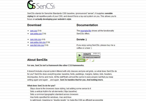
3. SenCSs
Pronounced as “sense”, this tool allows you to actually focus on developing your website’s style.
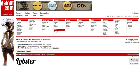
4. dafont
This is a beautiful collection of fonts, free to download.
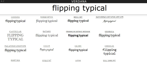
5. flipping typical
Try out different text and see how it will look like on various web safe fonts.
Throughout history, be it internet or real world, typography has always been very important. It is as important today as it was back then. Typography is an integral part of web design, from headlines to sub headlines to smaller-sized text in the content, typography is a pure combination of art and science and it is a very crucial piece of web design.
Perfecting typography means perfecting readability, ease, usability, and all in all graphic harmony for readers. By doing so, we achieve our goal as web designers to communicate clearly with our readers and they in turn, enjoy our web designs.
This post may contain affiliate links. See our disclosure about affiliate links here.

