What are webpages made of? Knowing the individual elements that make up a website can really help you understand how to craft an effective webpage. And if you’re new to web design or development, it can give you a basis and a checklist to start with. It’s time to learn what all websites contain!
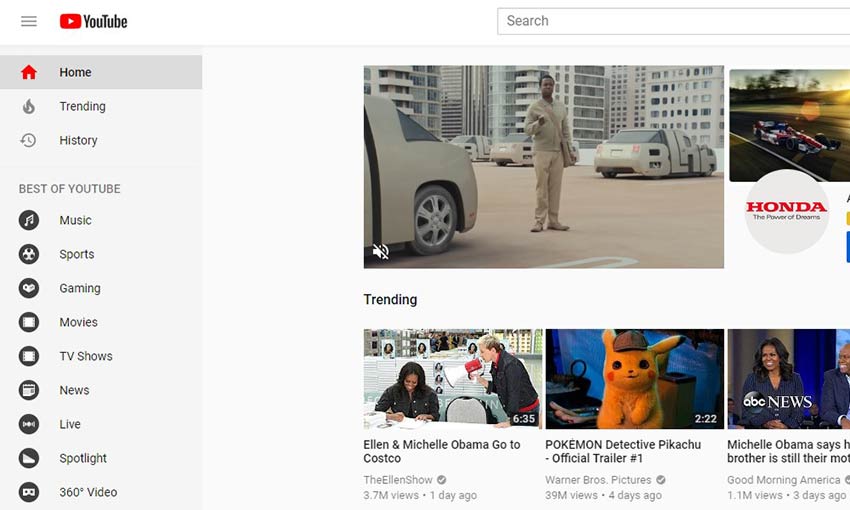
Header
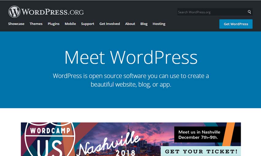
There’s no better place to start than at the beginning. Many websites open with a header or menu, and this is often where the navigation links will go, along with your company’s logo or website title. Other important tools such as language switchers and login links fit in here as well. Anything you want people to have immediate access to!
Some designers choose to make the header “sticky”, so the navigation links will follow you even as you scroll down. If the header is on every webpage, clicking the logo often brings you back to the homepage. These small conveniences can make a big difference.
Links
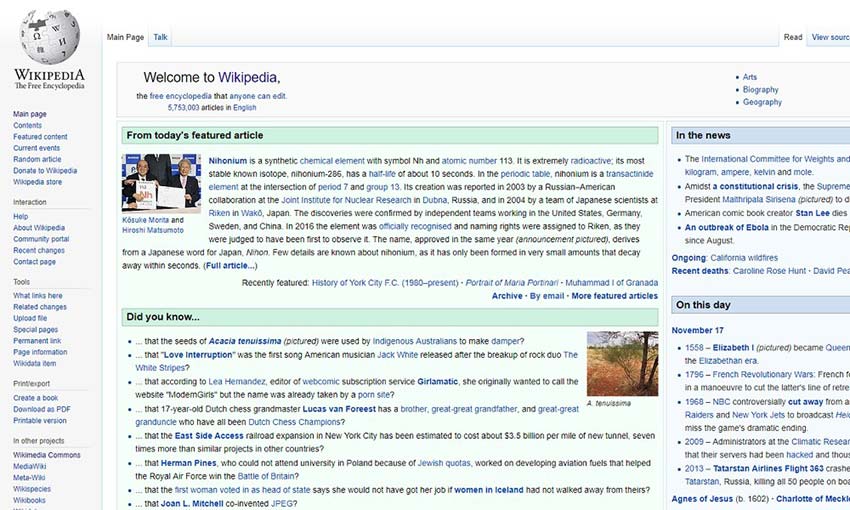
99.9% of webpages include links. This is the basis of how you get around the website. Links should be underlined, colored differently, or otherwise made to stand out from normal text. Like all interactive elements, you should take steps to ensure that visitors know they’re interactive.
Navigation
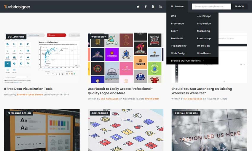
Unless you’re making a one-page site, you probably are going to include navigation, or links to the main pages on your site. There are many ways to create a navigation bar. You can make a simple horizontal list in the header, vertical menus that pop out when you press a button, or dropdown lists that appear when you hover a link.
One thing’s for certain: However you design your navigation, it needs to be clearly visible and easy to access on any device.
For sites with a ton of content, such as blogs, it’s advisable to include a search bar and make sure to categorize and sub-categorize your content. You can also include breadcrumb navigation, which shows the sub-category of the site you’re on.
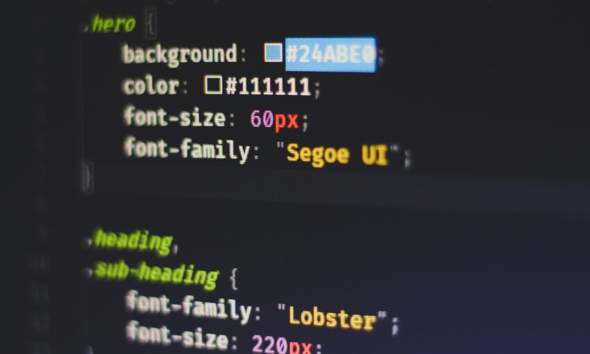
Hero Image
Good web designers know that visual content is essential to capture interest, and the hero image embraces that by sticking a banner right at the top of the homepage. Besides being eye candy, hero images often include a little blurb about the company and a call to action for its services.
A call to action is simply a phrase, usually a link or button, asking your visitors to do something. “Download Now”, “Try Free”; make it obvious what will happen when they click that link!
Instead of a traditional hero image, some sites go for a banner (such as a large logo) right below the navigational menu. This can act as a convenient link back to the homepage.

Sidebar
The sidebar is an optional but invaluable feature, simply because it can be used for anything! Blog archives, navigation, sign-up forms, category listings… Sidebars have a ton of potential.
If your site content is narrow in width, a sidebar can break up all that white space and make the page look less dull.
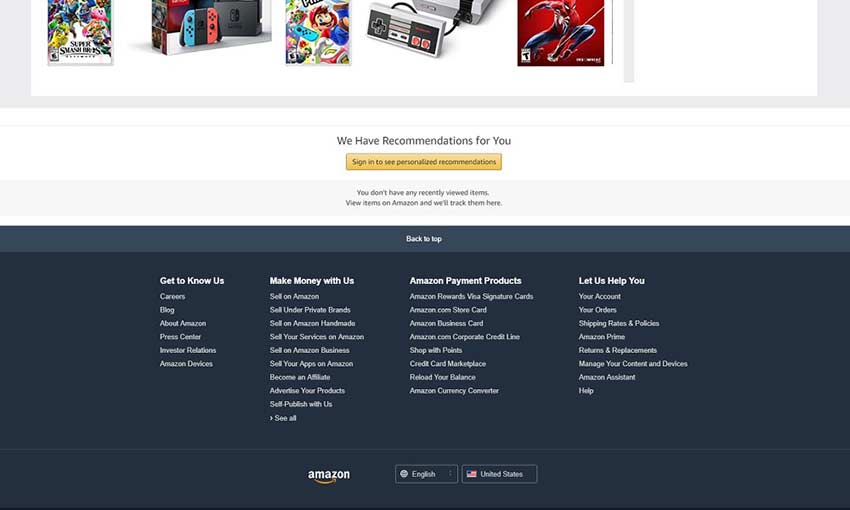
Footer
Last but not least, the footer. This is where you stick your privacy policy and terms of service, your social media buttons, your company’s information. Some use the footer as a throw-away for those boring-but-necessary links. But if well designed, it can be a great way to close out your site and invite people to visit you on social media or sign up for the email list. Don’t neglect your footer!
Learning the Basics
Beginner or veteran designer, it’s important to have your basics down. You can’t create a website without including at least some of these elements, so you need to understand what they are and how to implement them well. We hope this was a good introduction or refresher course into web design!
This post may contain affiliate links. See our disclosure about affiliate links here.