There’s so much to learn from case studies. They can help you reach conclusions for UX ideas, optimization techniques, and even written copy.
For this post I’m focusing on conversion rate case studies that aim to increase total sales and signups with just a few small tweaks.
If you go through each case study one by one you’ll find many CRO ideas that you can try on your own projects.
The UX Designer Toolbox
Unlimited Downloads: 500,000+ Wireframe & UX Templates, UI Kits & Design Assets
Starting at only $16.50 per month!

1. Homepage Sign-up Form
Most visitors enter a company website from the homepage. This is the best place to capture leads if you can place a signup form above the fold in clear view.
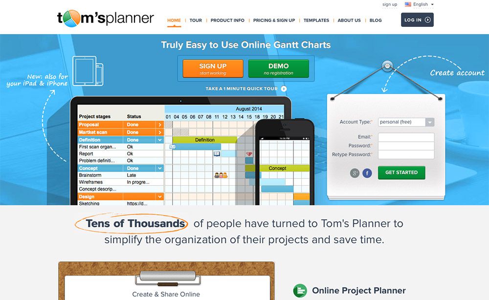
This case study, with Tom’s Planner, increased total signups by 43% just by adding a form onto the homepage.
It seems like a crazy thing to overlook but it really makes a difference. Anyone hoping to add more subscribers to their newsletter should try out this simple design trick.
2. Promo Code Boxes
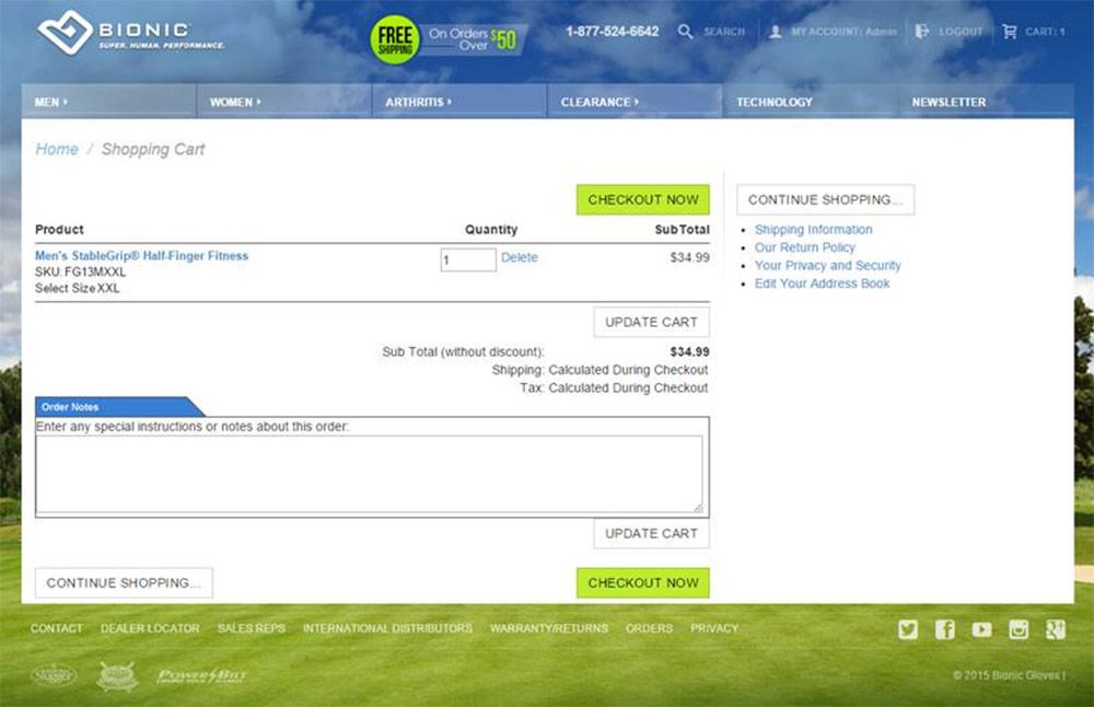
There’s an interesting study done on Bionic Glove’s ecommerce checkout page. They ran a promo code box on the checkout page and noticed a lot of potential buyers left the page to go search for promo codes in Google, then never came back.
By simply removing this promo code box, total revenue increased by 24.7% over the testing period.
Some of this increase probably comes from fewer promotional codes that reduced pricing, but the company also saw an uptick in total conversions with more people completing the checkout process. Impressive results for such a strange test idea.
3. Stock vs Real Images
I always prefer natural photos over stock because they feel more relatable. Many companies still go with stock pics but this case study might be enough to change their mind.
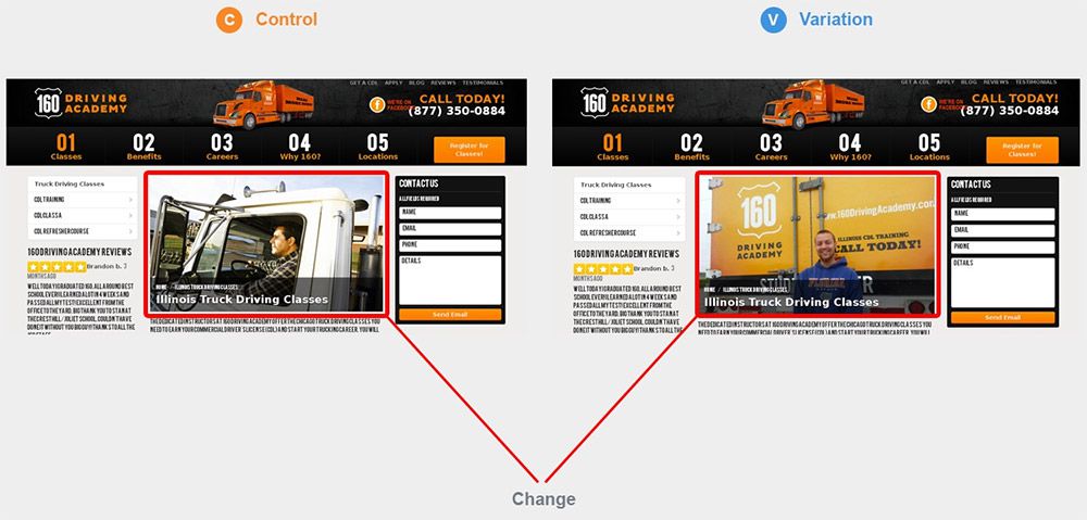
The 160 Driving Academy firm tested different photos on their homepage: one of a generic stock image and another of real students from the academy. They were testing against total signups for the newsletter and new registrations.
This A/B test garnered a 161% increase in total conversions across both actions combined. Just from switching one picture and making the site feel a little more authentic.
4. CTA Text
Great CTA buttons are necessary for solid conversions. Small mistakes with CTAs can cost you sales, and one big mistake that many overlook is their CTA copy.
The team at Price Charting ran this A/B test for two different CTA button texts:
- Download
- Price Guide
The latter increased total clickthroughs by 620.9% and clearly dominated over the generic “download” text.
Moral here is to make your CTAs specific. Tell the user what they’ll get or what’s in it for them, not just what the action should be.
For example, you might try writing “create my account” for your signup button instead of just “sign up.”
5. Adding “Free” Text

Here’s a case study that really surprised me because it’s just so simple. Soocial ran a small A/B test by adding “free” text right beside their CTA button.
The conversion rate jumped from 14.5% up to 18.5% which may not seem like a whole lot at first. But it’s well over a 20% increase which adds up if you’re running high volume traffic.
6. Short vs Long Pages
This frequently debated subject may be as old as the web itself. Should you build a longform landing page or use a smaller design?
Well the answer will differ based on your audience and what you’re selling. But this A/B test by PayPanther shows that the long-form redesign really did work better with a 372.62% increase in signups.
If you haven’t tested your landing page content, definitely try a longer-form style. You might be surprised with the results.
7. Homepage Copy
Header text on your homepage can also play a vital role in conversions. If you already have a signup form in your header then all you can do is optimize it for more user actions.
Check out this small study by VenueSphere to see how much copy affects conversion rates.
They ran a variation with a slight change in the subheading(not the heading) and this increased total leads by 69%. You may have to go through a few variations to see similar results, but there’s no doubt that your page copy matters.
8. Price Comparison Information
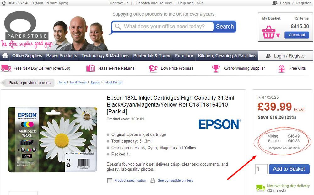
I don’t see this on many ecommerce sites but it seems like a solid idea for increasing growth. The team at Paperstone ran this A/B test where they added price comparisons next to their checkout form.
This comparison measures their price against their top competitors showing they were ultimately the more affordable choice.
Over a total of 12k unique visitors the price comparison increased total “add to cart” clicks by 10%. Not too shabby!
It’d be difficult to do this yourself if you don’t know your competitor’s pricing, but it may be worth testing if you run enough traffic through an ecommerce shop.
9. Product Page Authenticity
![]()
Here’s another case study focused on a really small change that blows my mind. ExpressWatches ran a test by adding an authenticity badge to their checkout page.
Over their 30-day test they saw a whopping 107% increase in total conversions. That means doubling the total number of sales, just from adding a small graphic saying “authorized dealer” next to the checkout button.
10. Larger Product Images
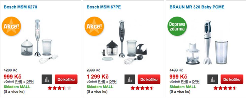
Whether you’re selling your own or affiliate products, images always gain higher clicks. Optimized images help a lot but you also want to consider total image size and how each photo fits onto the page.
That’s where this case study comes into play.
By making product images larger, the Czech ecommerce shop Mall.cz was able to increase total sales by 9%.
That doesn’t sound like much, but when you’re running a large ecommerce site with many different products, 9% can be a huge difference in revenue. And this higher CR happened not by adding anything new or changing text, but just by resizing the images they already had.
11. Remove Nav From Landing Page
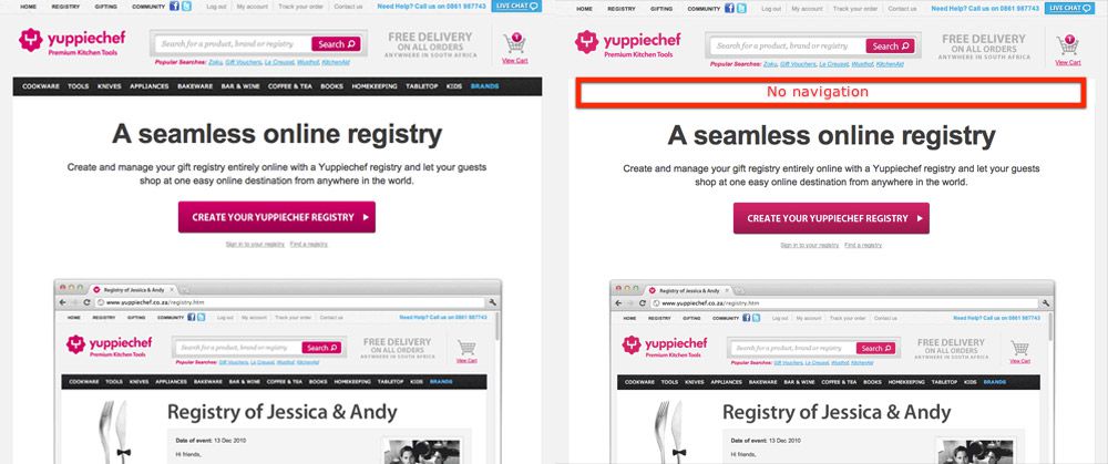
I should note this split test seems best suited for websites running paid traffic through AdWords or Facebook. But I suppose it could work for any traffic source!
The company Yuppiechef tested conversions across a landing page with no navigation menu vs a variation with a navigation. They saw a difference of 100% more conversions on the winning lander with no navigation.
Seems crazy right?
It ultimately depends on how people find your page and what their goal is by visiting the page. If they don’t want to browse your site, then they’ll only be interested in the content that’s right in front of them.
Anyone who designs a lot of landing pages might give this a shot.
12. Image vs. Video
Earlier I mentioned a case study with stock photos vs natural photos. Well this case study tested an image against an embedded video on the homepage.
The goal was to increase “add to cart” clicks, and the video lander achieved this with a 12.6% CTR increase.
It seems like videos on landing pages increase trust and build a bond with visitors who actually watch the video. This makes the site feel more human and ultimately captures the minds of visitors on the fence about purchasing.
But none of these case studies are bulletproof for every website. The best way to improve your conversion rate is to run your own tests and see what happens.
Take a peek at our A/B testing guide to learn more and maybe even find some results that get you writing your own case study.
This post may contain affiliate links. See our disclosure about affiliate links here.