As time goes on, web design is getting more innovative. Rather than just displaying information, websites are works of art, featuring complex animations, unique layouts, and micro-interactions. So many of these things are possible through CSS.
CSS gives style to normal, boring webpages, and enables everything that makes websites enjoyable to interact with. 2019 brings with it plenty of new horizons for web design, and these are the 7 CSS trends that will define the year.
UNLIMITED DOWNLOADS: Email, admin, landing page & website templates

CSS Grid
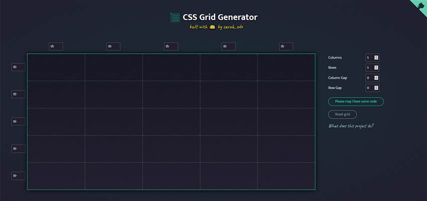
The prevailing standard for grid-based layouts has been Flexbox. In fact, at its height at the end of 2018, nearly 83% of page loads on Chrome used Flexbox. But a new contender has entered the ring.
That new contender is Grid. Still young and only seeing use on about 2.25% of page loads, it has still skyrocketed in popularity, only representing 0.25% of page loads at the start of 2018.
Grid is being hailed as better than Flexbox. Flexbox gives you control of vertical or horizontal alignment, but not both at once. Grid, on the other hand, does.
CSS experts attribute the lack of popularity to the fact that most major websites are not using it. After all, that data above is based on page views, not the raw number of pages that use Grid. It was only fairly recently that major sites adopted Flexbox, so it makes sense that they don’t want to make the switch just yet.
2019 will definitely see the growth of Grid, however, because it unlocks a degree of creative freedom that other options do not offer.
CSS Writing Mode
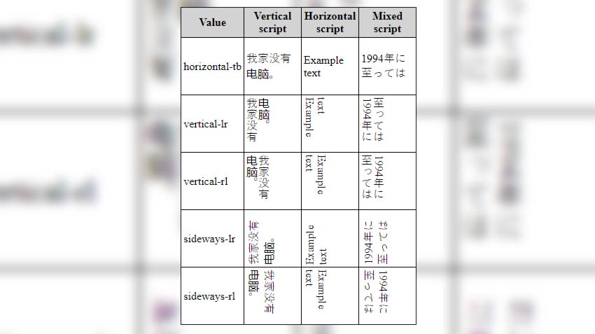
Not all languages are written and read from left to right. For languages that go in other directions, you can use the writing-mode CSS property.
Flow text from top to bottom or from right to left and adjust the horizontal and vertical values. You can even display text sideways vertically, rotate the text for certain designs, and mix scripts.
Mobile Animations
Animations as a tool for engagement are increasingly popular. Websites will start to use more and more animated loading icons, page loads with limited design, etc. to keep the user’s attention.
An example of this from a popular website is YouTube. Open the YouTube mobile app and scroll through the videos. If you stop for a second, the video will autoplay with the sound off and show captions.
Animations are also used as indicators for an action or a task. Animated buttons and lists are becoming common too. Read all about using CSS animations here.
Popular Frameworks (Bulma, Tailwind, Bootstrap 4, etc.)

CSS frameworks have been around for a while, but they’ve only been growing in popularity in recent years. If you need a primer on what a framework is, read this.
Awwwards defines a framework as:
“A framework is a standardized set of concepts, practices and criteria for dealing with a common type of problem, which can be used as a reference to help us approach and resolve new problems of a similar nature.”
As we move to a more mobile web, frameworks are adjusting to compensate. Styling and design are changing, animations and action are becoming more common, and a focus on simplicity and end user experience are more important than ever!
In 2019, many well designed frameworks are taking the lead and helping developers and designers to ship faster than ever. A few of the most notable frameworks being used around the web in 2019 are:
- Foundation – Responsive, mobile-first framework and used as enterprise solution;
- Bootstrap 4 – Bootstrap is one of the biggest CSS frameworks used worldwide, version 4 comes with new features for color schemes and utility classes;
- Materialize – Popular framework focused on material design styles;
Read more about the top CSS frameworks for 2019 on Scotch.io.
Single Pages, Experimental Navigations
With websites becoming almost as synonymous as having your own profile on social networks, more users are turning to simpler solutions and single page options to send traffic out to other locations.
Common examples include:
- Linktree – Simple page with links to your socials, products, etc.;
- Carrd – Simple, free, fully responsive one-page sites for pretty much anything;
- About.me – More professional focused portfolio site, similar to LinkedIn but with room for creativity;
- Instapage – Top landing page builder for businesses and startups;
These single page websites are being taken further with the creative use of CSS and styling to enhance the experience. The Next Web highlighted ‘large and experimental navigations’ as one of their ‘10 exciting web design trends you can’t hide from in 2019’. So why are people moving to these interesting layouts?
Because of action. With the focused large buttons and navigation, users immediately click to the desired location. Whether that be a shop, informational page with hours/details, or just a new video/song.
More and more websites are simply set up as directing points for companies, individuals, or groups to send traffic to and then distribute out. Musicians use Linktree and other services to share their new songs on all streaming platforms, and get a cut of the affiliate revenue in the meantime.
Variable Fonts
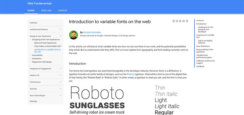
Highlighted by Carrie Cousins for Designmodo’s ‘Top 17 Web Design and UI Trends for 2019’, variable fonts are defined as “a collection of master styles, with one central ‘default’ master (usually the Regular font style) and multiple registered “axes” which tie the central master to the other masters. For example, the Weight axis might connect a Light style master to the default style and through to the Bold style master. The individual styles that can be located along this axis are called “instances”.
What this means is that fonts are more responsive and seamless across devices and platforms. You can scale the width, sizing, and other aspects of the font more easily without jumping from font weight to font weight or switching fonts entirely.
Check out an example of the variable typeface ‘Amstelvar’ on GitHub. Also read the full analysis on variable fonts and how they will change the web from Google.
Scroll Snapping
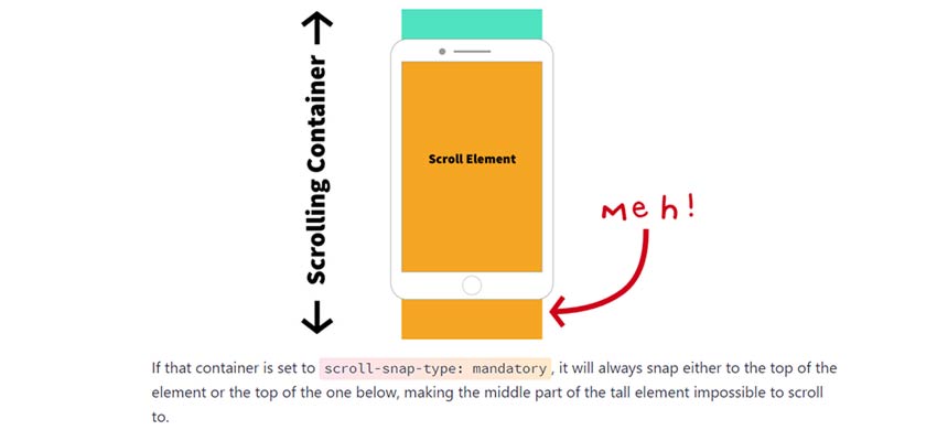
Last, but not least, scroll snapping is a relatively new technique used for snapping users to certain scroll points. Rather than a fluid motion down the page or left to right, you can have the page scroll in increments. Popular uses of this are for swiping through products or details on a page, scrolling through a book/reading experience, and sliding down a page with incremental blocks of information.
CSS Tricks features a great guide on Practical CSS Scroll Snapping.
The guide features information on browser support, best practices, and the properties you should use to ensure your scroll snapping works as intended.
Want to see how scroll snapping works? Check out these examples on Webkit.
The Present and Future of CSS
There you have it. These are 7 of the top trends and developments for CSS in 2019. What is your favorite trend?
This post may contain affiliate links. See our disclosure about affiliate links here.


